logos
It's likely that you already have some notion or gut feeling about what you want to look like on paper; I can help you articulate it and convey it to the world visually. The starting point of a solid branding plan is usually a logo!
Consider that your logo will become a powerful and flexible branding tool from which you'll get a lot of mileage. To a large extent, the look your logo conveys will propel subsequent projects (think web site, blogs or social networking sites, print ads, business cards, etc.) The momentum from a well thought out logo absolutely saves time and money.
Logos can be started from scratch or completed based on sketches or ideas you bring to the table. I can give existing logos a facelift, evolve them, or make any types of additions or subtractions.
How much do they cost? To read more about the logo design process and the associated costs, please go to the info page.
Stu Batty Tools - Logo
Over the past twenty-seven years, Stuart has taught over 3,000 amateur and professional woodturners. He has demonstrated and taught in 12 countries and for over 180 different American Association of Woodturning Chapters across the USA. Stuart Batty Tools is the extension of Stuart’s questioning attitude and quest for knowledge and improvement; a number of these improvements are patent pending and all of them are incorporated into the SBT product line. Without question these are the most advanced, precise, and best performing woodturning tools available.
![]()
Broadway Presbyterian Church Nursery School | New York, NY
A logo for a play-based preschool in NYC. See web site here.
Robert McWilliams | Louisville CO
This logo conveys vibrancy, balance and health; it's rooted from the ground up and suggests spiraling energy in an enlivened body. The icon is also a play on the image of a spine, as one of Robert's hallmark offerings is extensive expertise and awareness of human anatomy and movement as the core of his therapy.
Victory Hydro Gardening | Louisville CO
![]()
The Chef's Life
Got Your Back Sac | Asheville, CO
A mesh fabric backpack type bag that has been marketed to large retailers as a plastic bag alternative.
GreenStar Electric Company LLC | Boulder, CO
Boulder's premier solar installation company! See web site site at GreenstarElectric.com.
![]()
Laura Klein Photography | Eldorado Springs, CO
![]()
Gratitude (cafe, restaurant & bar) | Asheville, NC
This logo was created for a restaurant in the heart of an historic and newly polished hotel in the center of downtown Asheville. The client wanted a Buddha and something that signified many times, items, services. The name "Gratitude" came to me one night as the perfect expression of their concept. The hand-drawn logo was based on a Buddha statue that the owner's mother made.
Honey Tree Preschool | Longmont CO
Inspired by the colors in Where the Wild Things Are, this logo is friendly, safe, sheltering, sweet, artistic and playful and while being polished and sophisticated -- mirroring the values of client's daycare business.
![]()
Home-Renu | Longmont CO
This logo was drawn for an existing business in need of fresh visual communication to speak to its completely "green" philosophy about painting, plastering, or otherwise transforming our living spaces. The aspen leaf is an adored, local symbol; I've streaked the logo with "paint" and texture; I've chosen colors that are earthy, natural; colors that are "living".
The American Table Culinary Tours | Asheville NC
New non-profit adventuring down the nation's eaten path! Tours devoted to good eating spots, legendary cooks and neglected regional delicacies. Celebrate the nation's culinary heritage and figure out what's next for American cuisine. More at TableTours.org.
Louisiana Culinary Trail | LA
A logo for a project highlighting the food, traditions and culture of Louisiana. (Project underway.)
![]()
Liberty Street Baggage | Asheville NC
This client wanted an modernized redo of an outdated logo which would implicate the things that set them apart in the luggage industry: all their products are hand-made in the USA; bags and pocketbooks are colorful, playful and somewhat "custom created" by customers; and they're relatively "feminine" in style.
Beyond Birth Midwifery Care LLC | Boulder CO
Beyond Birth Midwifery Care is made up of three certified nurse-midwives who work closely with hospitals and pediatricians' offices. Their logo needed to convey "caring", "soft" and "inviting"; it also needed to look medically professional so it wouldn't seem out of place at any doctor's office. Bold earthy colors, straight-forward but interesting fonts and a strong central image convey these qualities nicely. This logo is a visual celebration of motherhood, all who support it, and it compliments the medical community at large beautifully. See BBMC web site »
![]()
Bikram Yoga Longmont | Longmont CO
This logo suggests balance, flow, harmony, unity, wholeness. It has somewhat of an earthy, organic aesthetic -- all typical components of a yoga environment. The watery, peaceful blue hues (taken straight from the walls of the studio) balance out the warm, almost glowing orange. The orange visually advertises the heat element for which Bikram's yoga is best known. (BUSINESS NOW CLOSED)
![]()
Portable Shed Company, LLC | Longmont, CO
Wee Willow Kids' Clothing | Asheville NC
Handmade in the USA warm washables for kids of all ages. The logo relies heavily on the lettering -- it's organic and flowing, like a handwritten note from your grandmother or the limbs of a willow tree in early spring.
![]()
BiblioBucks™ Points, Coupons & Gift Certificates | Asheville NC
These three logos are based on the parent company, Biblio.com's, existing logo (see it online here.) Color coordinated, hand drawn art and bright, cheery colors were used to generate excitement (while capitalizing on brand recognition) about a new incentive program introduced to online shoppers.
Wink: Heads & Threads | Asheville NC
Full service and new in concept, this salon/boutique combo desired a hip, bold logo that popped -- almost like a neon sign. There's a bit of a '50s diner/barber shop notion to it as well, which works nicely considering a couple of their defining brands are vintage-inspired. The interior of Wink is a cool ice blue, referenced in and around the logo. Girly but none too fussy their logo reads as playful, smart, bold and beautiful -- much like Wink's clientele.
Prenatal Ultrascan, P.A. | Asheville NC
This logo is for a new medical office offering Nuchal Translucency screening, a new medical standard for pregnant women which asesses a baby's risk for congenital and genetic abnormalities. The logo takes a cue from part the procedure itself: an ultrasound. The choice of orange for the word "scan" serves as a visual alert (orange is typically a safety, or warning color.) The orange is balanced by the soothing green (a hue that typically calms and promotes well-being) surrounding it.
![]()
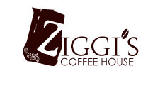
Ziggi's Coffee House | Longmont CO
This (proposed) logo for independently
owned Ziggi's is straight-forward: bold contrast, an inviting rich
brown "coffee" color and classic coffee bean and bag imagery
make it easily recognizable as a coffee shop, yet distinguishable
from its competition. Owners wanted an impressive and characteristic
"Z" to use as a branding tool elsewhere. In this
case, the "Z" on the coffee bag (almost) says it all.
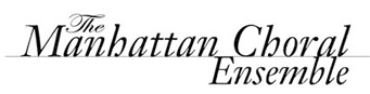
The Manhattan Choral Ensemble | New York NY
"Classic" and "lyrical" were driving forces behind the creation of simple but effective logo. The thin black line dividing words references the five horizontal lines which make up the musical staff; the cursive font and placement of the word "The" was inspired by the treble clef. See more work for the MCE in the print section.
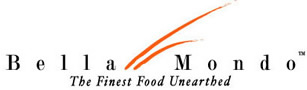
Bella Mondo | New York NY
This is a logo for a national retailer of gourmet potatoes and onions. The tag line, "The Finest Food Unearthed" is a big part of what works for this logo. A sophisticated font and the two organic "swishes" (think warm, windy afternoon in the onion field perhaps?) tie it all together. The swishes were designed to take on the colors of respective packaging.
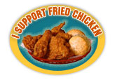
Benefit, Willie Mae's Scotch House | New Orleans LA
A fun and effective emblem advertising a benefit dinner for Willie Mae's Scotch House, a New Orleans landmark soul food restaurant which was virtually destroyed by hurricane Katrina. I wanted the logo to feel like an old-fashioned, homemade button that might be seen on the lapel of a (fried chicken lover's) sports coat.
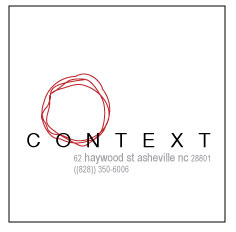
Context |Asheville NC
A sparse and very stylish women's boutique with an urban, minimalist feel needed a logo that evoked a sense of s p a c e, breathing room, and a hit of energy in an organic way. The mix of hand rendered, red concentric circles and plain, generously spaced sans serif letters on a simple white square works.
Coburn & Schulz | New York NY
Co-owners Tom Schulz and Trisha Coburn truly emphasize collaboration, which is represented by the gold ampersand -- the dominating feature of the logo. The principle idea behind this NYC-based, multi-faceted design company is to give shape to living environments through innovative use of color and texture. Visit coburnandschulz.com and more of this client's work in print.
![]()
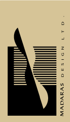
Madaras Design Ltd. | Ann Arbor MI
Designer and builder Douglas Madaras needed a logo that described his signature style -- something he calls "spatial sculpting." His interiors are flowing, somewhat "zen" like and are equally masculine and feminine in feel. They are largely inspired by the natural world, characteristically curvy, strong, and spacious -- while leaving just the right amount of unexpected area for inhabitants to "discover" on their own. See MadarasDesign.com.
Wedding Insignia | NC/Ohio
Simple and elegant, the couple wanted a design that incorporated their initials and gave the feel of an elegant, traditional wedding.

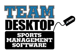
TEAM Desktop | Chapel Hill NC
Nate Kipp needed a logo to give an immediate visual description of the team management software he created for college coaches. The unmistakable"sports team" font and that the logo mimics the shape of a desktop computer conveys the idea perfectly.
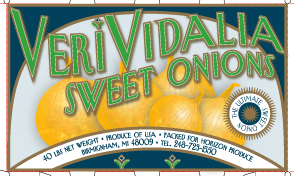
VeriSweet Onions™ | Birmingham MI
Jim Huston described his new type of onion as the "rolls royce of sweet onions." He needed a logo and packaging that conveyed a superior taste and quality to the standard onions. The backdrop and logo were inspired by the paper labels on old-time fruit and produce crates.
EstaSweet Onions™ | Birmingham MI
Another project from Jim Huston showcasing his latest find in the growing sweet onion marketplace. I designed his web site as well: see EstaSweet.com for more!